中文简体
中文简体





Previous Post
Rock texture boards are increasingly used in large‑area vertical spaces such as lobby feature walls, corridor wall cladding, and elevator lobby walls.
Designers choose rock texture boards because their visual language is powerful enough—the ruggedness of granite, the layering of slate, the mottling of terrazzo—to transform a wall from “background” into “protagonist.”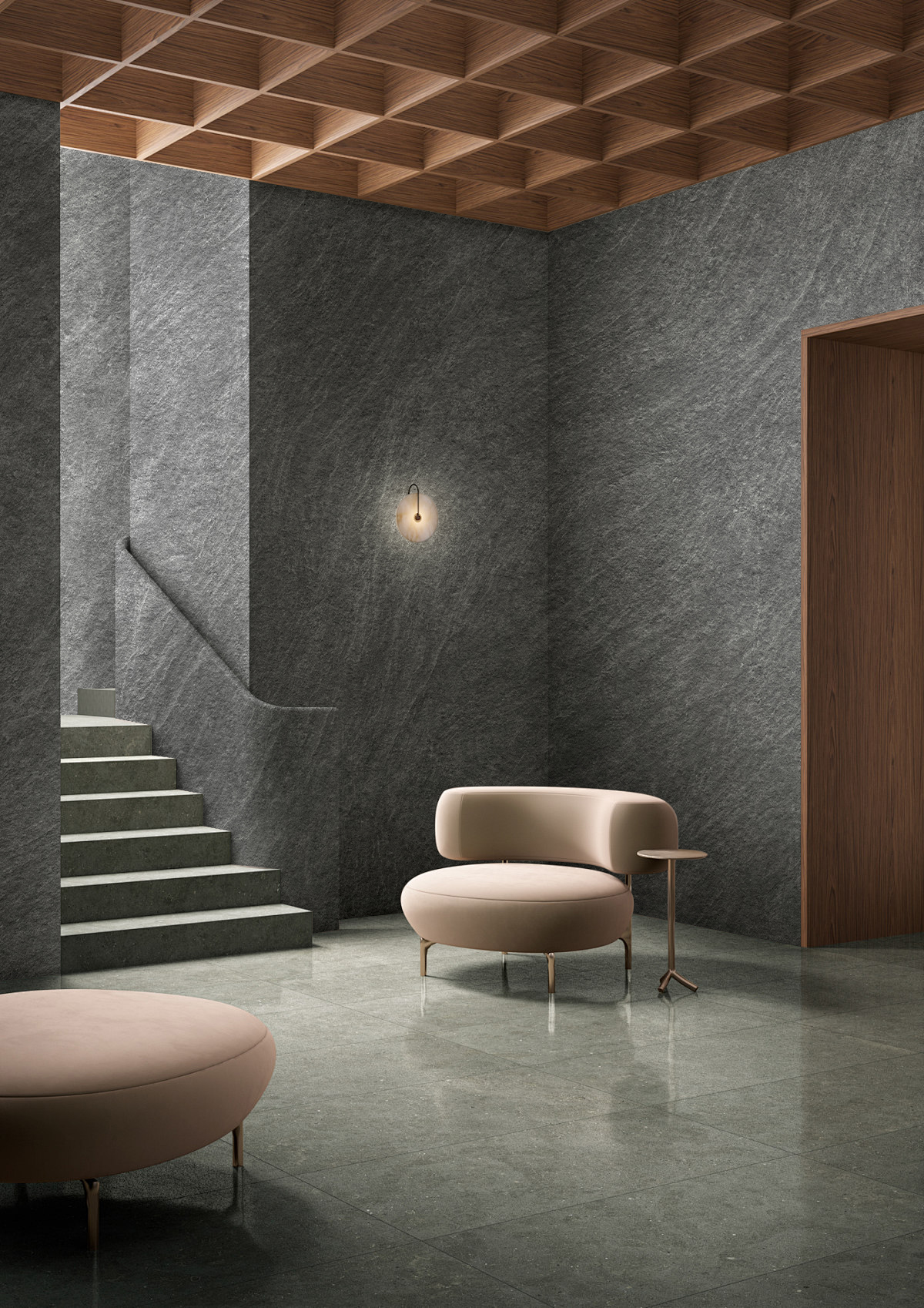
But the execution of large‑area rock texture walls presents an easily overlooked engineering challenge: texture “continuity.”
A 6‑metre‑wide rock feature wall may require 20 to 30 panels to be assembled. Ideally, these panels should look like “one piece” when joined—consistent texture direction, continuous light‑and‑dark colour blocks, and no visual “breaks.”
In reality, however, issues often arise such as “the texture of this panel does not match that panel”—pattern misalignment, inconsistent depth, and colour block jumps.
This issue is often not about printing precision, but about substrate density uniformity.
YAKCO’s test data points precisely answer the core question of “texture continuity” in large‑area rock texture applications.
More about Technology: yakco technology
1.The “Continuity” of Rock Texture Depends First on Substrate “Consistency”
The texture of rock is printed on the decorative layer. But no matter how high the printing precision, if the substrate is inconsistent, the joined panels will “reveal the flaws.”
Different density, different embossing depth.With the same pressing process, higher‑density substrates produce shallower textures, while lower‑density substrates produce deeper textures.
If density fluctuates significantly within the same batch, the embossed rock texture depth varies—one panel has full grain, another has flat grain—creating a visual “jump” when joined.
Different density, different ink adhesion.
The light‑and‑dark colour blocks of rock grain rely on uniform ink distribution on the decorative layer.
When substrate density is uneven, the compression rate of the decorative layer varies during pressing—areas with higher density compress the ink more, resulting in darker colours; areas with lower density have lighter ink adhesion, resulting in lighter colours.
Within the same batch, colours vary from light to dark, and when joined, they look like “patches.”
YAKCO’s substrate density is stable at 0.72 g/cm³, with minimal batch‑to‑batch fluctuation.
This means that panels from different batches, under the same pressing process, produce essentially the same rock grain depth, ink adhesion, and texture clarity.
The texture of the first batch and the tenth batch show no visual difference.
2.The “Edge Sharpness” of Rock Texture Depends on the Decorative Layer’s “Anchoring Force”
The realism of rock texture comes not only from the printed pattern but also from the microscopic concave-convex created by embossing—the grain of granite, the roughness of slate. If the edges of these microscopic rise and fall are blurred, the “realism” of the rock texture is greatly diminished.
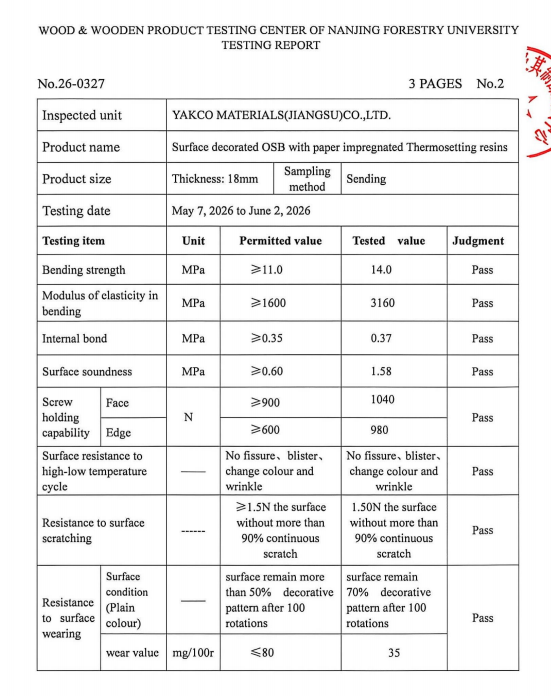
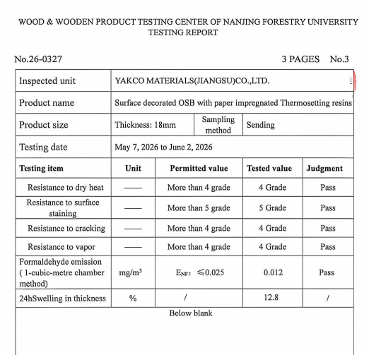
YAKCO achieved a surface soundness of 1.58 MPa, while the national standard requires only 0.60 MPa.
This data reflects the bonding strength between the decorative layer and the substrate—the higher the value, the more firmly the decorative layer is “nailed” to the substrate, and the higher the edge sharpness of the rock grain.
For large‑area rock texture walls, the significance of surface soundness is: the edge sharpness of the rock grain is consistent across every panel. There is no difference between “this panel has sharp texture, that panel has blurred texture.”
When joined, the texture and layering of the rock texture remain consistent from the head to the tail of the wall.
3.The “Joint Challenge” of Large‑Area Rock TextureWalls: Every Joint Tests Consistency
A 6‑metre‑wide rock grain feature wall may require 20 to 30 panels to be assembled. Between every two panels is a joint.
The visual continuity at the joints directly determines the “premium feel” of the entire wall—aligned texture, consistent depth, uniform colour tone make the wall look like “one solid piece of stone”; misaligned texture, inconsistent depth, colour variation make it look “pieced together.”
The joint challenge for rock texture is more subtle than for wood grain and leather pattern. Wood grain has direction—misalignment is easily noticeable; leather pattern has no direction—slight misalignment is not obvious. But the light‑and‑dark colour blocks of rock grain have a pattern—dark areas simulate the mineral veins of rock, light areas simulate the matrix of rock.
If the light‑and‑dark colour blocks of adjacent panels “do not align,” the visual effect “jumps.”
YAKCO’s narrow‑window quality control ensures consistent substrate density and surface soundness across different batches.
Every panel the installers receive has matching rock grain depth, colour tone, and edge sharpness.
When joined, the texture is continuous, depth consistent, and colour uniform—as if cut from a single piece of stone.
4.The Engineering Value of Rock Texture“Texture Continuity”
For engineering projects, rock texture “texture continuity” directly translates into three practical values:
Reduced on‑site selection and trial assembly time. Ordinary rock texture boards with significant batch variations require installers to spend considerable time selecting panels with similar texture and colour tone, trial‑assembling, marking, and sorting.
YAKCO boards are consistent across batches—installers can proceed directly without “picking and choosing.”
Lower rework rates and material waste.
Panels with mismatched textures can only be discarded or used in secondary areas, causing material waste. YAKCO boards match when joined—rework rates approach zero.
Improved final delivery quality.
Large‑area rock texture walls with continuous texture, consistent depth, and uniform colour tone achieve a visual effect close to the “single‑piece” feel of natural stone, elevating the project’s quality and completeness.
5.Conclusion: The “Continuity” of Rock Texture Is the External Manifestation of Substrate Consistency
Designers choose rock texture boards for the “integrity” of natural stone—continuous texture, consistent depth, uniform colour tone.
But this integrity cannot be guaranteed by printing precision alone—it requires substrate density uniformity and surface soundness to maintain.
YAKCO Rock Design Melamine Board uses the two data points of density 0.72 g/cm³ and surface soundness 1.58 MPa to ensure that every batch of panels “looks the same.”
Rock texture depth is consistent, colour tone is consistent, edge sharpness is consistent—when joined, the texture is continuous, depth consistent, and visual flow seamless.
When a designer says, “I need the rock texture on the large‑area wall to match,” YAKCO provides an answer with data—an answer that does not require choosing between “design effect” and “constructability.”
YAKCO specialises in the R&D and manufacturing of Melamine Faced Board, offering parallel series of Rock Design, Wood texture, Leather Design, and Art Deco, providing “continuous texture, uniform across panels” decorative solutions for high‑end commercial spaces and residential projects.
More about Rock: Rock Design Melamine Faced Board